LA Fitness
Introducing
A passion project that was initiated by my trips to the local LA Fitness near my home. This project became a fun branding exercise where I focused on updating the current branding.
Goals
The goal of this project was to transform the current LA Fitness branding into a more youthful and fun aesthetic. I wanted to complete this project within one week.
Timeline
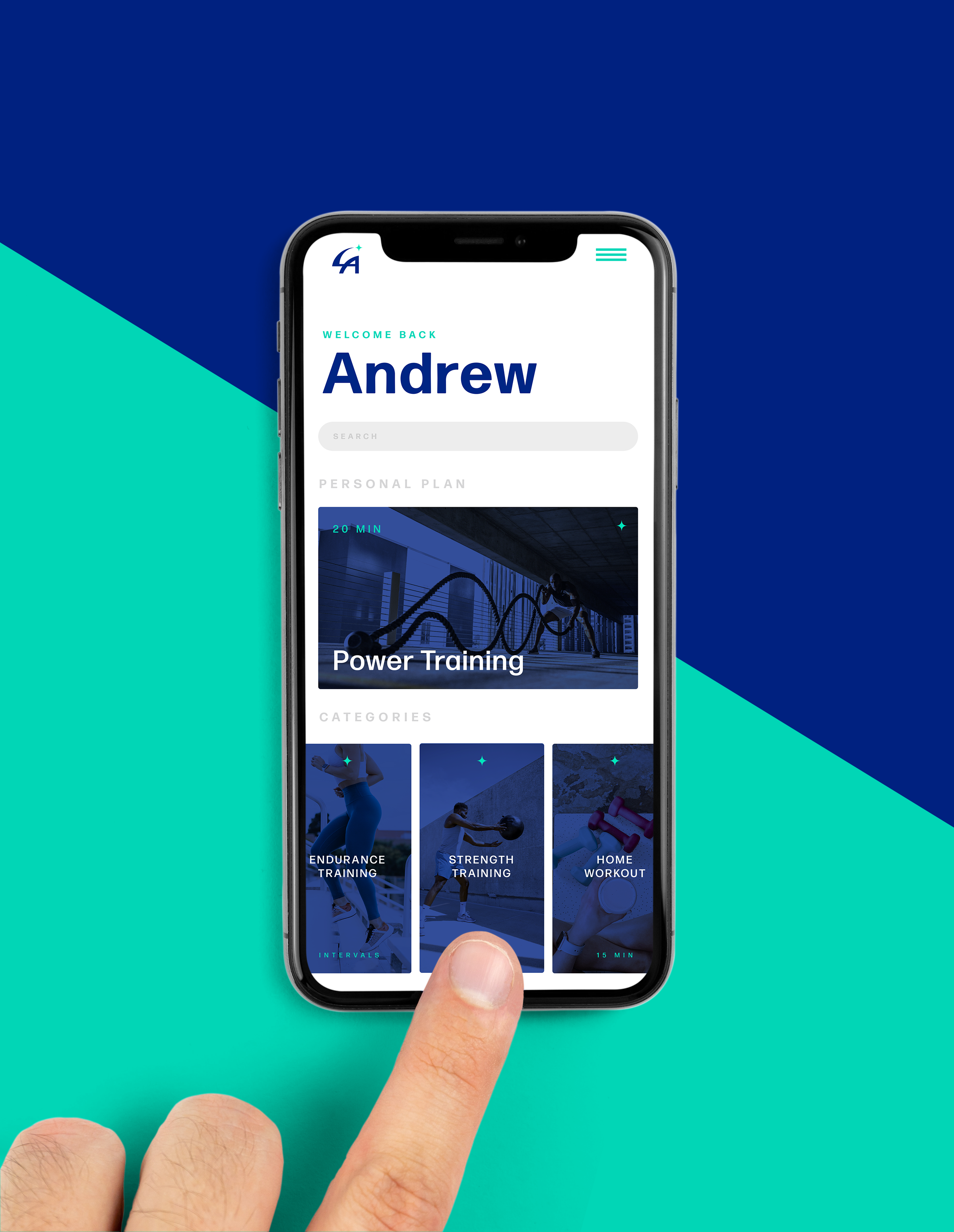
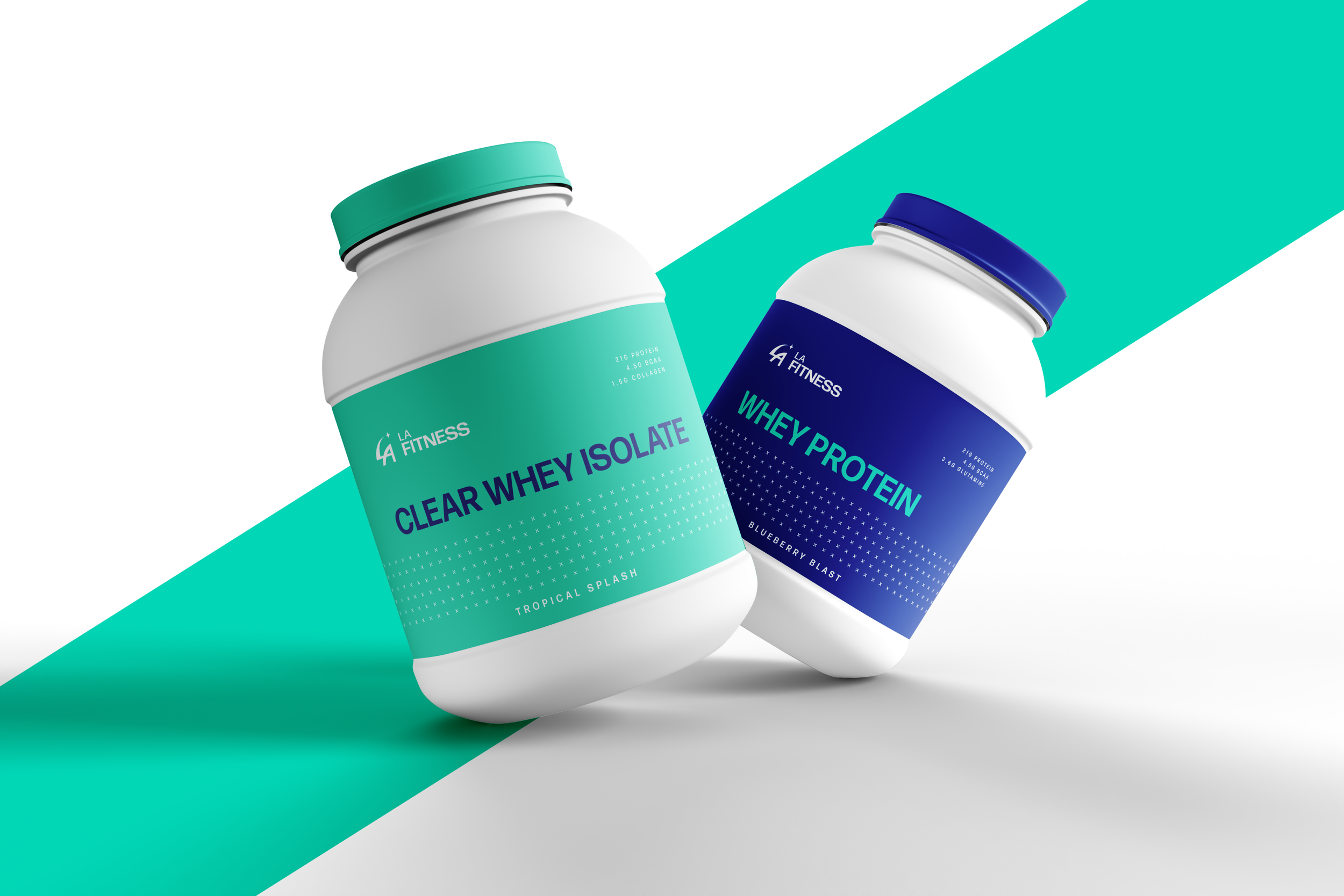
I was successful in completing this project in it’s entirety in one week. Including the new logo, colour palette, typography, and mock-ups.
Challenges
The main challenge with this project was creating a fresh, inviting brand that captured the LA atmosphere while ensuring a unique brand identity.


Process
Discussion and Ideation:
I started this passion project by crafting several mood boards that carried a retro LA beach aesthetic. Following this step, I completed a competitive analysis to further understand how best to differentiate the LA Fitness brand.
Sketches and Digital Work:
Moving on to sketching and digital design, I developed three logo concepts that stayed true to their existing logo mark. I wanted something fresh and unique but did not want to stray too far from their current brand mark to ensure brand recognition.
Mock-ups and Presentation:
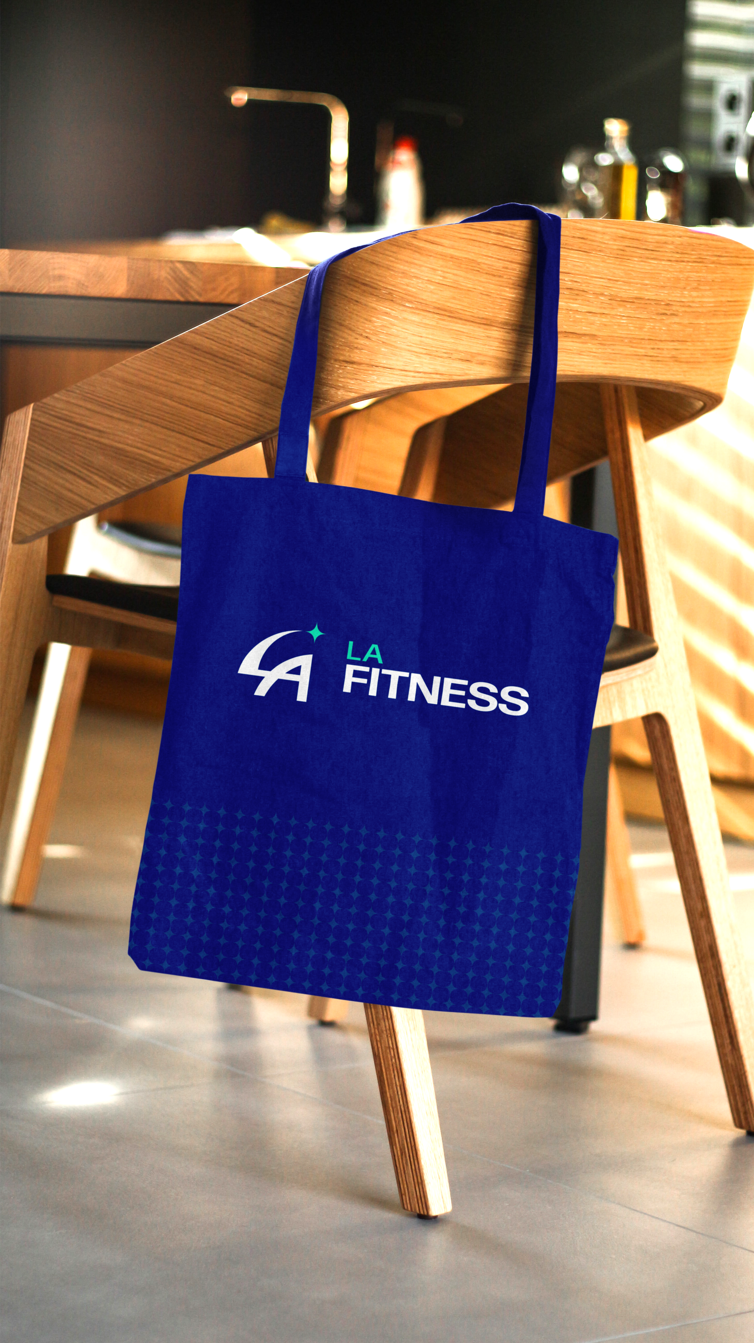
In the final stage, I narrowed down the three logos to a final logo. This final logo carries a similar curved and athletic structure as their current logo mark; however, I integrated it into the “LA” letters. I added a single star at the tip of the “L” to emphasize the quality of the gym brand.


